
3 min read
What makes a good YouTube thumbnail? What thousands of winners share
We counted what the thumbnails in the Thumbsy Vault have in common: how many show a face, how many use text, the colours, the layouts and the feeling they go for.
Most advice about thumbnails is opinion. So we counted. The Thumbsy Vault holds 9,782 YouTube thumbnails, each picked by hand because its video did better than that channel usually does. Every one is tagged with what is in it: the colours, the layout, the feeling, the objects. This article is what those tags add up to. The numbers on this page are recounted every day.
A good thumbnail makes people curious
The clearest pattern is the feeling. 60% of the thumbnails are built on curiosity: they show part of something and leave the rest for the video. The next most common feelings are seriousness, surprise and excitement, and they are far behind.
Curiosity is a gap between what the viewer sees and what they want to know. A before and after with the “after” hidden. A person looking at something outside the frame. A number with no explanation. If your thumbnail already answers the question your title asks, there is no reason left to click.
Most have words on them, and few of them
79% of the thumbnails have text on them. The ones with text scored higher than the ones without: 2.7× against 2.3×. The most common layout tag in the whole Vault is bold typography, on 43% of thumbnails.
The words are short. Three or four, in a heavy typeface, big enough to read on a phone. They never repeat the title. The title says what the video is about and the thumbnail adds the punchline. There is more on this in text on YouTube thumbnails.
- Replit: Make an app for that
@replit · 306M views
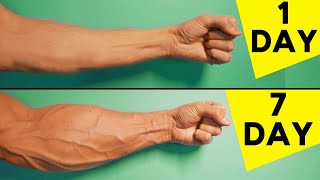
- 5 Best Exercises For Forearms | Home Workout
@TonySolo · 13M views
- We're Not Ready for Biocomputing
@clarifiedmind · 11M views


About half show a person
51% of the thumbnails show a person. That is lower than most people expect, and it changes a lot by niche: 79% in business and 17% in gaming. A face helps when the video is about a person or their opinion. It does little when the subject is a game, a machine or a place. See the niche by niche numbers in do faces in thumbnails get more views?.
They use a few strong colours
The colours that come up most are white, black, red, blue and green. White and black are there because of text and backgrounds. The colour that does the selling is usually one bright accent, most often red. The typical thumbnail has 4 colours in total, not a rainbow. More in the best colours for YouTube thumbnails.
They compare two things
27% use a split screen or a side by side comparison and 9% are a before and after. Two things side by side tell a story without a single word: cheap against expensive, then against now, mine against theirs.
- Replit: Make an app for that
@replit · 306M views
- Minecraft: 3 SIMPLE Starter Houses!
@LombyMC · 30M views
- I tried 500 years of Haircuts
@morgandonner · 8.8M views


A checklist for your next thumbnail
- One subject. If you have to explain the picture, it is too busy.
- A reason to be curious that only the video answers.
- Four words or fewer, readable at phone size.
- A face only when the video is about a person.
- One bright colour against a calm background.
- Check it small, next to other thumbnails from your niche, before you publish.
The fastest way to use all of this is to start from a thumbnail that already worked. Pick your niche in the thumbnail makers, choose an example, and make your own version of it.


