2 min read
Text on YouTube thumbnails: how many words, which fonts, where to put it
How much text should a YouTube thumbnail have, which fonts read best, and where should the words go? Simple rules, backed by thousands of winning thumbnails.
Text can make a thumbnail or bury it. The right three words turn a nice picture into a question people need answered. A full sentence turns it into something nobody reads. Here is how to get it right.
Should a thumbnail have text at all?
Usually, yes. 79% of the thumbnails in the Thumbsy Vault have words on them. Their videos scored higher than the ones without text: 2.7× against 2.3×, measured as how many times the channel’s usual views each video got.
But it depends on the niche. Where the idea is abstract, like money or habits, words do the explaining. Where the picture is the reward, like food or sport, fewer thumbnails use them.
How many words
Four or fewer. A viewer gives a thumbnail about a second, on a small screen, next to a dozen others. That is enough time for “I QUIT”, “$0 to $10K” or “DON’T BUY THIS”. It is not enough for a sentence.
- Here's Why
@jamestalaricoTX · 42M views
- Beginners Guide to Dropshipping in 2026 (18+ Hours)
@JordanBown · 5.2M views
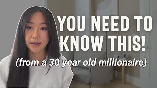
- I became a millionaire at 26. Here's 13 lessons for anyone in their 20s.
@VanessaLau · 3.8M views


Which fonts work on thumbnails
Readability beats personality. The typefaces that hold up at small sizes are heavy, wide sans-serifs:
- Impact, Anton, Bebas Neue: tall and condensed, good for one or two big words.
- Montserrat Black, Poppins Black, Inter Black: rounder and modern, good for clean, minimal thumbnails.
- Bangers, Komika Axis: comic style, common in gaming and kids’ content.
Avoid thin weights, scripts and anything with fine detail. Use one typeface per thumbnail, two at the very most, and keep the same one across your channel so people learn to recognise it.
Where to put the text
- On the side with the calmest background. Text over a busy area needs an outline, a shadow or a solid box behind it.
- Away from the bottom right corner, where the video length sits.
- Opposite the subject. A face on the right and words on the left is the most common layout for a reason.
- Large: the words should take up a quarter to a third of the frame.
Colour and contrast
White text with a dark outline works on almost anything. Yellow is the usual second choice. Colour one word, the most important one, and leave the rest white. More in the best colours for YouTube thumbnails.
Check it before you publish
Shrink the thumbnail to phone size and read it in one second. If you cannot, cut a word or make the type bigger. In Thumbsy you can tweak the words on any thumbnail from the thumbnail makers by typing what to change.